
Ever had those moments where you couldn’t decide between painting your living room grey or brown? Or ever stepped into your bedroom and suddenly felt sad without knowing why? Perhaps it is time to consult some colour theory for advice.
Colour theory looks at how humans perceive colours, and how different colours look when mixed or contrasted with each other. Home colour therapy builds on colour theory and further posits that the colour of your room can influence your moods. This idea has been around for some time and is not exactly a new trend when it comes to interior design. It has been observed that different colours can affect your moods in different ways and, when done right, can emotionally uplift your home.
Many of us in fact internally associate colours with feelings. Although we may not always realise it, the colours in our surroundings can very much influence
Having some understanding of how colour therapy works may help you create and choose appropriate colour schemes for your home.
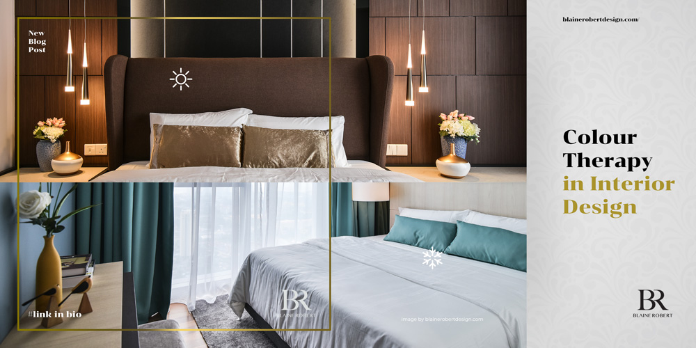
Warm colours
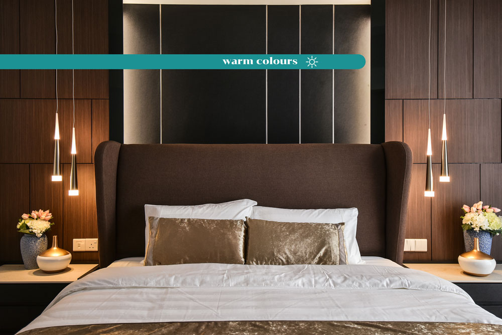
Warm colours such as red, orange or yellow often evoke feelings of energy, optimism, and happiness. They reflect more light and stimulate a person’s eyes more than cool colours do. Warm colours are also action colours — they increase heart rates, appetites, and signal danger. That is why you see most fast-food restaurants using such tones — they make you hungry that way. Here’s how warm colours can influence your room design.
- Red
As one of the most intense warm colours, red can stimulate love, passion, anger, and power. It has been shown to speed up respiration, and heart rate, and increase blood pressure. While red is a great stimulant colour, too much of it can be overpowering — so be sure to balance it out with some cool hues and neutral tones.
Red is best used for the dining room and living room.
- Pink
Associated with love and kindness, pink is a muted cousin of red. While it is still able to stimulate creativity and playfulness, large exposure to it does have a calming effect on the psyche. This is known as the pink effect. In fact, did you know that the shade “drunk-tank pink” has been used in prisons to calm inmates? It can relieve feelings of aggression and neglect.
This colour is best used in offices, bedrooms, and nurseries.
- Orange
Similar to red, orange brings a burst of energy and enthusiasm. It promotes activity and evokes excitement, so it’s perfect for rooms you’ll be doing a lot of activities in.
Use orange for playrooms and exercise rooms.
- Yellow
Yellow is generally an uplifting colour and can brighten your mood and instil a feeling of confidence. It stimulates mental activity and promotes memory and concentration. In fact, yellow can look rather elegant in most interiors. Since this colour easily catches the sunlight, it is, therefore, a great colour to instil feelings of joy and liveliness. Yellow accessories such as chairs and desks can be used in offices or study rooms.
Yellow is best used for living rooms, bathrooms, kitchens, and dining rooms.
Cool colours
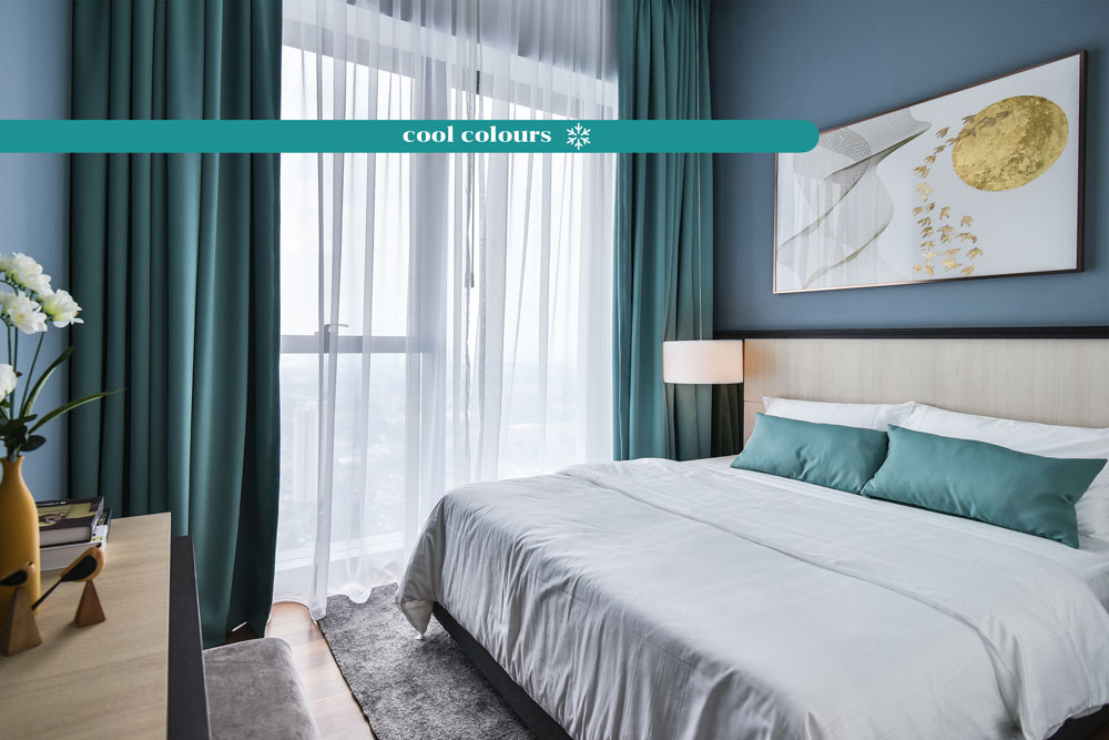
Cool colours are a lot less stimulating. In fact, they tend to be a lot more soothing and peaceful. Here’s a fun fact for you: since the eye focuses the colour green directly on your retina, the colour is said to be less straining on your eye muscles, which may be the reason why cool colours make you feel more restful.
- Green
As previously mentioned, green is one of the most restful colours for your eyes. It helps to relieve stress, strain and anxiety. Additionally, green has a balancing power as it is in the centre of the colour spectrum. It restores spiritual balance and connects the body and soul.
Colour therapy often links green to the circulatory system including the heart and the lungs. It is also said that this restorative colour can help improve fertility, encourage composure, and clear your mind. Integrate a green wall into the interior of your home to enjoy the benefits of this refreshing colour. Alternatively, you can incorporate plants and nature for a splash of green.
Use green in bedrooms, living rooms, and kitchens.
- Blue
Since blue is a very calming colour, it often makes you feel relaxed, serene, and at peace. It is also known to lower blood pressure, steady breathing, and slow down heart rates. Light blues are great and are best balanced with warm hues and furnishing.
This colour is best used for bedrooms, bathrooms, and any meditative spaces.
- Purple
Historically, the colour purple signifies royalty and luxury. It is a dramatic colour that gives off a mysterious yet sophisticated vibe. Dark purples are known to stimulate creativity while lighter purples are known to be calming and light.
Purple is best used in bedrooms, offices, and living rooms.
Having a general sense of what each colour does will help you better determine what colour palette to go for each of your rooms. Consider the primary function of the room — what is the main activity going on in that space? With that in mind, pick a predominant colour and select a colour scheme accordingly.
Neutral colours such as white, black, and grey also play a part in colour therapy. White, for example, help to make your room look more spacious and open. Although it is neither a calming nor stimulating colour, white can act as a happy medium that leaves you feeling clean.
Earth tones such as brown and beige have been observed to stimulate conversation as well. As such, they are often placed in living rooms and shared spaces where interaction is inevitable. These colours are also often used in conjunction with both warm tones or cool tones because of their versatility.
While too much of one particular colour can make a room seem jarring and unpleasant, neutral tones can be incorporated to balance out the vibrancy that a single-colour room might give off. As such, consider adding some neutral shades in the form of accessories, decor, and small pieces of furniture. This will add oomph to your room and make the dominant colour stand out even more.